Data Visualisation: Judo at the Olympics
Context
This was an individual project for the Data Visualisation course in the second semester of my second year (2026) at Thomas More. We were given a dataset on the modern Olympic Games (athletes, countries, sports, editions and results) and the goal was to turn it into an interactive dashboard that tells a story instead of just showing a wall of charts. I picked judo as my angle, partly because I trained judo myself, so I already had questions I wanted answered.
What I built
A four-page Qlik Sense dashboard that walks through one argument: judo is one of the most accessible Olympic sports. Each page is its own chapter:
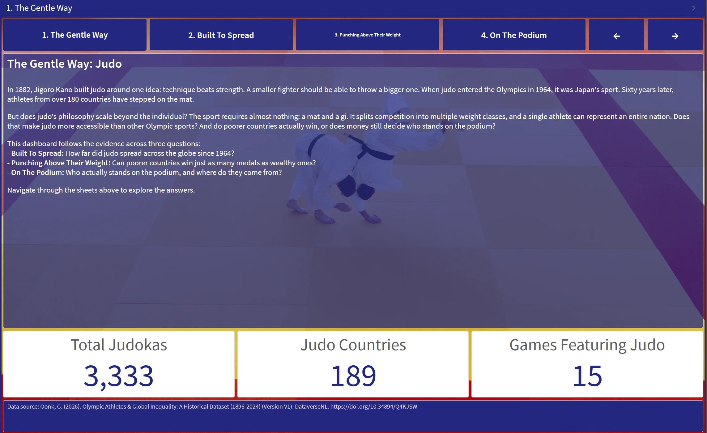
- The Gentle Way: a short intro to judo at the Games, with KPIs for total judokas, participating countries and medals.
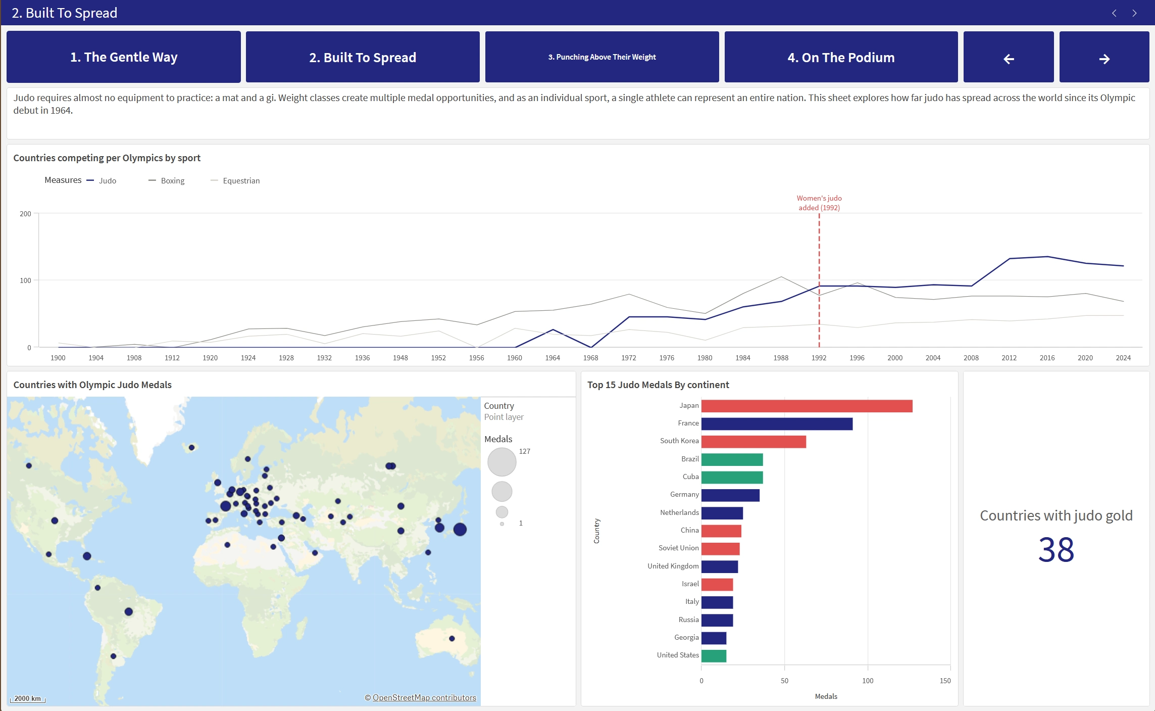
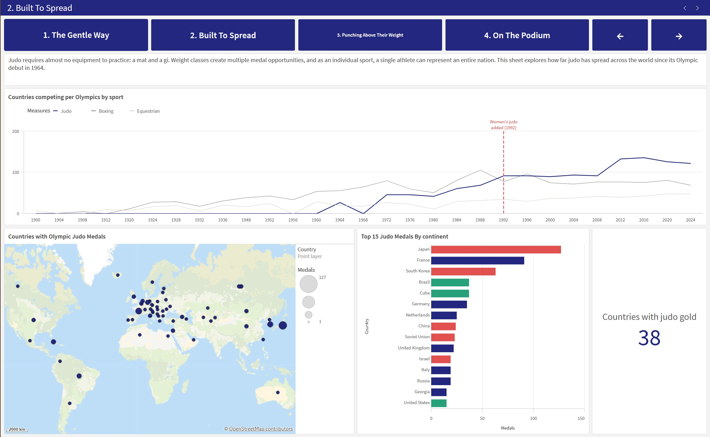
- Built To Spread: how far judo has spread compared to "expensive" sports like sailing and equestrian, shown on a map and over time.
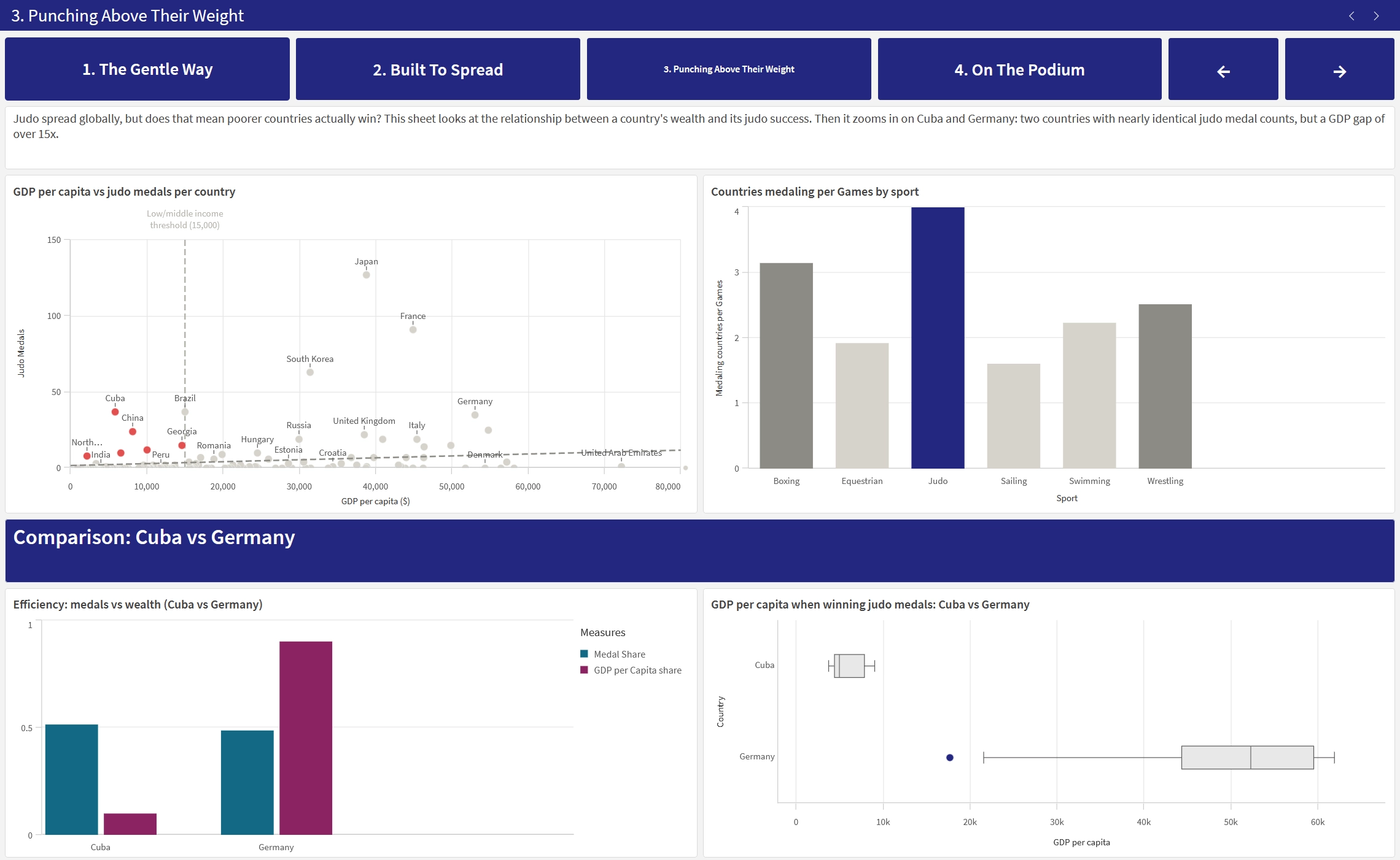
- Punching Above Their Weight: whether you need a wealthy country to win, comparing GDP per capita and population against medal results.
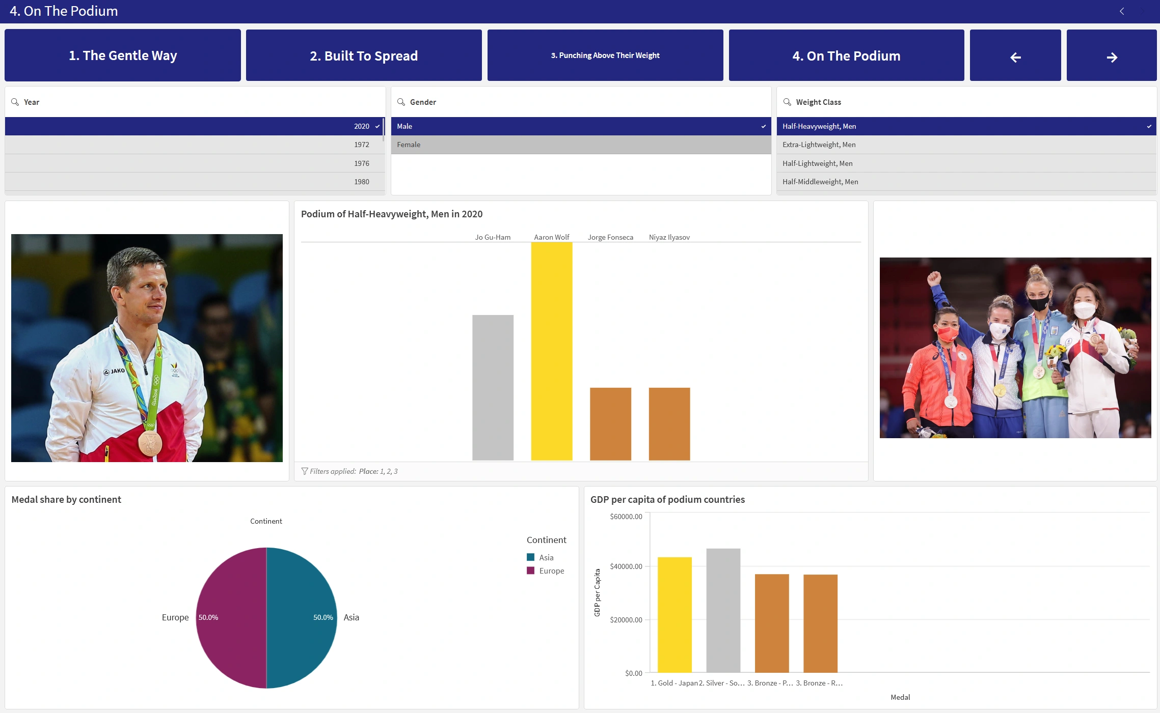
- On The Podium: the medal breakdown itself, with a podium view, gold/silver/bronze splits, and filters to explore any country, sport or year.
You move between the pages with buttons, so it reads like a guided story rather than four loose tabs.
Why I made it
The course goal was to practise the full path from raw data to a clear, honest visual story. I wanted to go past "make a few charts" and actually build a narrative with a point of view that the numbers back up. Choosing judo kept me motivated: because I care about the sport, I kept digging into questions like "which countries overperform relative to their wealth?" instead of stopping at the obvious answers.
How I made it
For the analysis I leaned heavily on set analysis, for example counting medals as Count({<Place={1,2,3}>} Place) and building a judo "accessibility rate" (the share of participating countries that actually reach the podium). I added calculated dimensions like a continent grouping and a medal tier (gold/silver/bronze), custom colour maps for medals and continents, and a drill-down from sport into individual events.
What I used
- Qlik Sense (Cloud) for the data model, dashboarding and interactivity
- Set analysis plus calculated dimensions and measures for the analytics
- Chart types: KPIs, bar, line, scatter, box plot, pie, a map, and a custom podium visual
Key takeaways
- Set analysis is powerful. It let me ask very specific questions (medalists only, judo only, per continent) without ever touching the underlying model.
- A dashboard needs an argument. Grouping the pages into a story with navigation buttons made it far more convincing than a set of unrelated tabs.
- Context beats raw counts. Judo medal totals say little on their own. Placing them next to GDP and participation is what made the "accessible sport" point actually land.